Your logo is the face of your brand.
It’s the first thing people see, the image they remember, and the anchor that holds your identity together across every touchpoint—from social media to packaging to pitch decks. It’s not just about making something look good. A strong logo creates recognition, trust, and emotional connection.
And in a world of endless noise, it might be the most important design decision you ever make.
Your Logo Is Not Your Brand, But It Represents Everything You Stand For
Let’s get one thing clear: your logo is not your brand.
Your brand is the emotional and psychological relationship you build with your audience. It’s the perception people have when they hear your name. But your logo? It’s the shortcut to that relationship. It’s the symbol people associate with everything you offer—value, trust, quality, culture.
That’s why logo design isn’t a task to rush or outsource blindly. It deserves research, strategy, and deep creative thought.
What Makes a Great Logo?
A logo isn’t just about beauty. It’s about function. And the best ones share a few key qualities.
Simplicity
Think Apple, Nike, McDonald’s. The simpler the design, the easier it is to remember—and to scale across platforms and formats.
Memorability
A great logo sticks in your mind after just one glance. That kind of recall builds brand equity.
Versatility
Your logo needs to work in a variety of settings: from a favicon on a website to a storefront sign. Color, black and white, large, small—it must hold up in every scenario.
Timelessness
Trends come and go. Avoid the urge to follow flashy aesthetics that will feel dated in two years. Think long-term.
Relevance
It needs to reflect your industry, your audience, and your brand personality. A playful logo might work for a kids’ brand but fail for a legal firm.
The Eight Main Types of Logos
Understanding the core logo structures helps you choose the right format for your brand.![]()
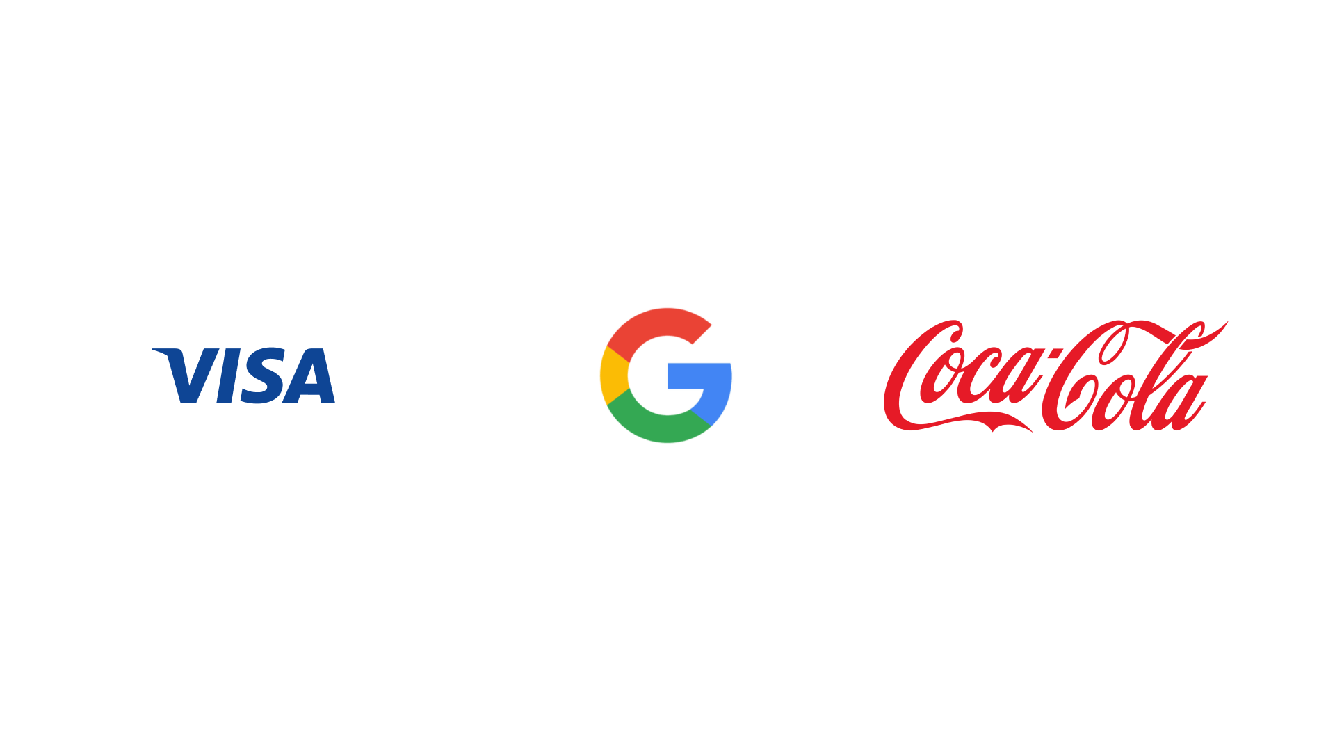
1. Wordmark (Logotype)
A font-based logo that focuses on the brand’s name alone.
Works best for businesses with a distinct and memorable name.
Examples: Google, Coca-Cola, Visa
2. Lettermark (Monogram)
Logo made up of initials or abbreviations.
Ideal for companies with long or complex names.
Examples: IBM, NASA, HBO

3. Brandmark (Symbol or Icon)
A visual icon or symbol without any text.
Best for established brands or those looking for minimalism.
Examples: Apple, Twitter, Nike (Swoosh)

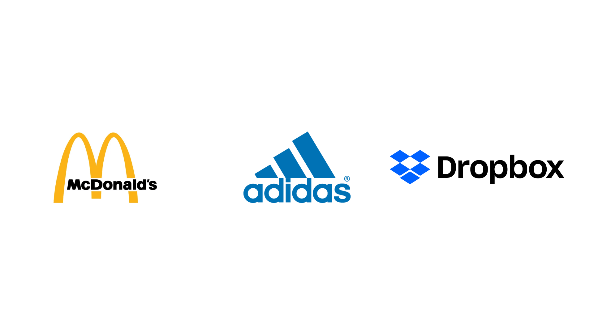
4. Combination Mark
Combines text and a symbol or icon.
Offers versatility—text and icon can be used together or separately.
Examples: Adidas, Dropbox, McDonald
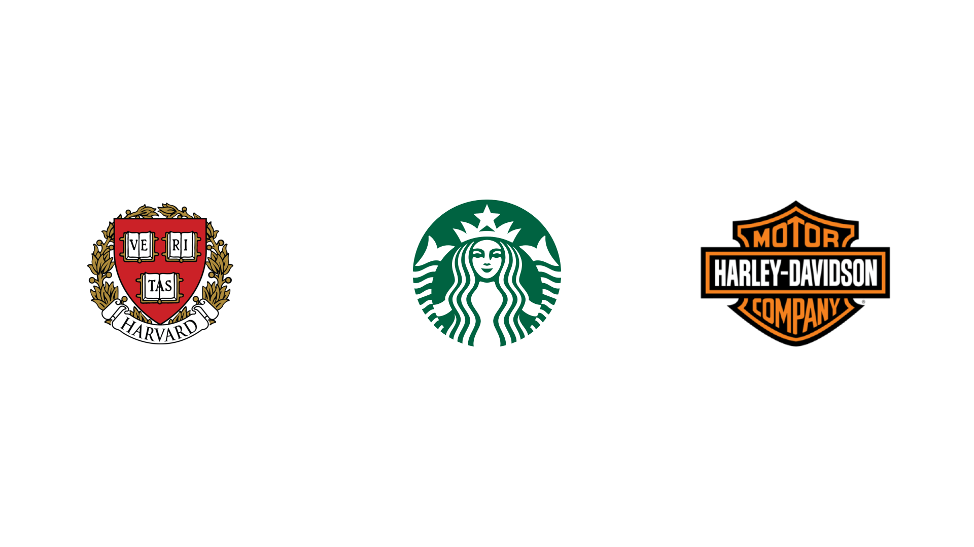
5. Emblem
Text placed inside a symbol, badge, or seal.
Traditional and often associated with institutions or government.
Examples: Harvard, Starbucks, Harley-Davidson
6. Mascot Logo
Features an illustrated character or figure representing the brand.
Adds personality and approachability, especially for family-friendly or playful brands.
Examples: KFC (Colonel Sanders), Pringles, Michelin

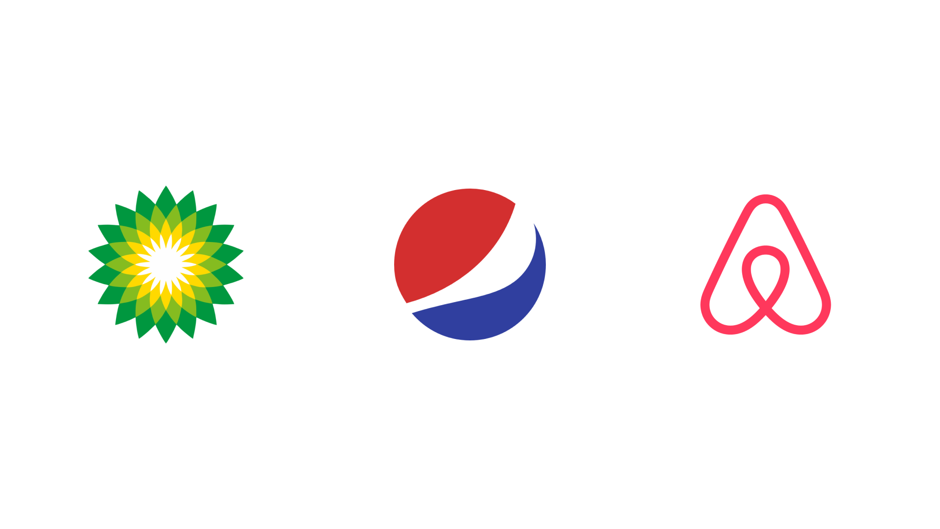
7. Abstract Mark
A geometric or abstract form that represents your brand.
Doesn’t depict a recognizable object but aims to convey a deeper meaning or emotion.
Examples: Pepsi, Airbnb, BP
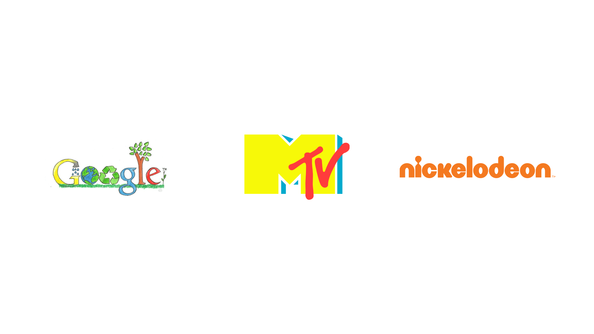
8. Dynamic or Responsive Logo
A flexible logo that changes in shape, color, or format depending on context (device, screen, campaign).
Ideal for modern digital brands needing adaptability.
Examples: Google Doodles, MTV, Nickelodeon
Each style has strengths. The choice depends on your brand’s tone, audience, and how you plan to scale.
Color, Shape, and Typography: The Psychology of Design
Logo design is rooted in psychology. Every visual decision—color, shape, spacing—affects how people feel about your brand.
Color matters.
Red creates energy and urgency. Blue builds trust. Green evokes calm and growth. Black suggests sophistication. Yellow triggers optimism. Choosing the right palette isn’t about favorite colors—it’s about emotion.
Shape matters.
Circles feel inclusive and friendly. Squares communicate stability and structure. Triangles imply innovation and momentum. Even symmetry vs. asymmetry can subtly impact how people perceive you.
Typography matters.
The font you choose speaks volumes. Serif fonts often feel elegant or authoritative. Sans-serif fonts lean modern and clean. Bold weights project confidence; light styles feel airy and gentle. Custom lettering can give your logo a truly unique voice.
Great logo design is emotional, not just visual.
The Logo Design Process: What It Should Actually Look Like
Here’s how we approach logo design at We Will Handle:
1. Discovery
We start with questions, not sketches. Who are you? What do you believe in? Who’s your audience? What’s your voice?
2. Research
We study your industry, competitors, and audience expectations to find opportunities to stand out.
3. Concepting
We explore ideas—sketching, refining, discarding. The best concepts rise to the top through iteration.
4. Design & Drafting
Once the direction is clear, we develop polished digital versions of your strongest concepts.
5. Refinement
We review, test, and adjust. Sometimes subtle tweaks—spacing, color, curve—make all the difference.
6. Delivery
You get your final logo in all necessary formats, plus a style guide that outlines correct usage across platforms.
This process ensures your logo is not only beautiful but functional, relevant, and strategic.
What to Avoid in Logo Design
Logo mistakes are common—and costly. Here’s what to look out for:
Too many fonts or colors.
It creates confusion and visual clutter.
Overuse of trends.
What’s popular today may feel outdated tomorrow.
Stock icons or clipart.
If your logo looks like a template, people won’t take your brand seriously.
Lack of flexibility.
If your logo doesn’t work in grayscale, or at 32px, it’s not done.
Ignoring your audience.
It’s not about what you like—it’s about what resonates with the people you’re trying to reach.
Is DIY Logo Design Ever a Good Idea?
There are plenty of tools out there—Canva, Looka, Wix’s logo maker—that let you whip up a logo in minutes.
That might work if you’re launching a weekend project or side hustle. But if you’re building a serious brand, DIY logos often fall short. They lack uniqueness, depth, and strategy. And they rarely hold up as your business grows.
Designing a great logo requires experience in brand thinking, typography, psychology, and visual systems.
If you’re in it for the long haul, hire a professional.
Let’s Talk Trends (But Use Caution)
While you want your logo to be timeless, staying aware of design trends can keep your identity fresh—if applied with restraint.
Some trends we’re seeing in 2025:
Responsive logos that adapt to different screen sizes
Abstract and minimalist icons with clever negative space
Typographic logos with bold, custom typefaces
Motion-based logos for digital-first brands
Use trends as inspiration—not as a rulebook.
Your Logo Is an Investment, Not Just a Graphic
If your logo feels outdated, generic, or misaligned with your brand, it’s worth revisiting.
Done well, a logo is one of the most cost-effective tools you have. It shows up everywhere—on your website, your product, your business cards, social media, signage, packaging. Every time someone interacts with your brand, the logo is there.
So don’t treat it like a quick design task. It’s your brand’s foundation.